
Understanding Colours: The Psychology of Shapes and Colours in Marketing & Branding
Discover how colours and shapes influence emotions, perceptions, and buying decisions. Learn the psychology behind effective marketing and branding to create memorable, impactful brand experiences.
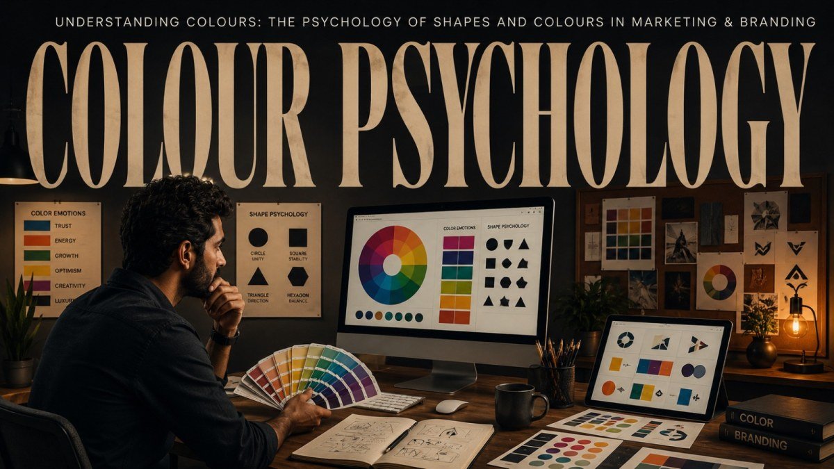
In today's competitive marketplace, building a memorable brand is about much more than having a great product or service. The way your brand looks plays a significant role in how customers perceive your business. From your logo and website to social media graphics and product packaging, every visual element contributes to creating a lasting impression.
Among all design elements, colours and shapes are the most powerful psychological tools in branding and marketing. They influence emotions, shape customer perceptions, build trust, and even impact purchasing decisions. Whether people realize it or not, they often form an opinion about a brand within seconds based on its visual identity.
At JiPra Animators, Lucknow, we understand that effective branding is not just about making designs look attractive. It is about creating visuals that communicate your brand's personality, values, and message. In this blog, we'll explore the psychology of colours and shapes, how they affect consumer behaviour, and how businesses can use them strategically to build a stronger brand.
Why Colours and Shapes Matter in Branding

Human brains process visuals much faster than text. Before a customer reads your company name or understands your services, they notice your colours, logo, shapes, and overall design style.
Studies in marketing psychology suggest that visual appearance heavily influences first impressions. Colours evoke emotions, while shapes create subconscious associations about your brand's personality.
For example, a luxury brand uses different colours and shapes than a children's toy company because each wants to communicate a different message.
Successful branding combines colour psychology and shape psychology to create a visual identity that resonates with the target audience.
The Psychology of Colours

Every colour carries emotional meaning. Although cultural differences may influence interpretation, many colour associations are widely recognized.
Blue – Trust, Stability, and Professionalism
Blue is one of the most commonly used colours in corporate branding because it represents:
Trust
Reliability
Intelligence
Security
Confidence
Banks, healthcare providers, technology companies, and corporate businesses frequently use blue to establish credibility.
Blue helps customers feel safe and confident when interacting with a brand.
Red – Energy, Passion, and Urgency
Red is a powerful attention-grabbing colour associated with:
Excitement
Passion
Energy
Action
Confidence
Restaurants, retail brands, sports companies, and clearance sales often use red because it encourages quick decision-making.
However, excessive use of red may create feelings of aggression or urgency, so balance is important.
Green – Growth, Nature, and Health
Green symbolizes:
Freshness
Nature
Wellness
Sustainability
Prosperity
It is commonly used by:
Organic brands
Healthcare businesses
Financial institutions
Agricultural companies
Environmental organizations
Green creates a calming and trustworthy experience.
Yellow – Optimism and Happiness
Yellow is associated with:
Positivity
Creativity
Optimism
Warmth
Youthfulness
Brands targeting younger audiences often use yellow to create an energetic and cheerful atmosphere.
Used carefully, yellow can attract attention without overwhelming the viewer.
Orange – Enthusiasm and Friendliness
Orange combines the energy of red with the positivity of yellow.
It communicates:
Fun
Confidence
Innovation
Affordability
Friendliness
Many startups and creative businesses use orange to appear approachable and energetic.
Black – Luxury and Sophistication
Black represents:
Elegance
Power
Authority
Luxury
Exclusivity
Luxury brands frequently use black because it creates a premium and timeless appearance.
When paired with minimalist design, black enhances sophistication.
White – Simplicity and Cleanliness
White communicates:
Purity
Simplicity
Minimalism
Cleanliness
Transparency
Healthcare, technology, and lifestyle brands often use white space to improve readability and create a modern visual identity.
Purple – Creativity and Premium Quality
Purple has long been associated with:
Luxury
Creativity
Wisdom
Imagination
Royalty
Beauty brands, educational institutions, and premium products often use purple to differentiate themselves.
The Psychology of Shapes

Just like colours, shapes also communicate powerful messages without using words.
Circles – Community and Unity
Circular shapes represent:
Friendship
Unity
Inclusion
Protection
Continuity
Brands that want to appear welcoming and people-focused often use circular logos.
Circles create a sense of harmony and emotional connection.
Squares and Rectangles – Stability and Trust
These shapes symbolize:
Strength
Security
Professionalism
Balance
Reliability
Corporate businesses, financial companies, and educational institutions often use rectangular structures because they communicate dependability.
Triangles – Innovation and Progress
Triangles suggest:
Direction
Movement
Growth
Leadership
Ambition
Technology companies and startups frequently use triangular elements to represent innovation and forward thinking.
Depending on orientation, triangles can communicate stability or action.
Organic Shapes – Creativity and Flexibility
Free-flowing organic shapes create feelings of:
Creativity
Comfort
Natural movement
Uniqueness
Lifestyle brands, wellness companies, and creative agencies often incorporate organic shapes into their branding.
Combining Colours and Shapes for Maximum Impact

Successful branding doesn't rely on colours or shapes individually—it combines both strategically.
For example:
A healthcare clinic might use blue with circular elements to communicate trust and care.
A fitness brand could combine red and triangular shapes to express energy and motivation.
An eco-friendly business may use green with organic shapes to reinforce sustainability.
The combination should always align with your brand personality and audience expectations.
Colour Consistency Builds Brand Recognition

One of the biggest branding mistakes businesses make is inconsistency.
Using different colour palettes across your:
Website
Social media
Packaging
Brochures
Advertisements
Business cards
can confuse customers.
Consistent colours improve brand recognition and help customers remember your business more easily.
That's why professional branding includes detailed brand guidelines specifying exact colours, fonts, spacing, and logo usage.
Shapes Improve User Experience

Shapes are not limited to logos.
They also influence:
Website layouts
Buttons
Icons
Infographics
Navigation menus
Social media creatives
Rounded buttons may appear friendlier, while sharp-edged layouts often feel more corporate.
Good UI/UX design uses shape psychology to guide user behaviour naturally.
Colour Psychology in Digital Marketing

Colour plays an important role in digital marketing campaigns.
Call-to-action buttons, advertisements, landing pages, and banners all use colours strategically to improve conversions.
For example:
Green buttons often suggest "Go" or "Continue."
Red creates urgency during limited-time offers.
Blue builds trust on service websites.
Orange encourages interaction without appearing too aggressive.
Testing different colour combinations can significantly improve campaign performance.
Common Branding Mistakes

Many businesses unintentionally weaken their branding by making avoidable design mistakes.
Some common issues include:
Choosing colours based only on personal preference.
Using too many colours in one design.
Ignoring cultural colour meanings.
Mixing inconsistent visual styles.
Overcomplicating logos with unnecessary shapes.
Following trends without considering long-term branding.
Professional designers create branding systems that remain effective for years rather than chasing short-lived design trends.
How JiPra Animators Creates Strategic Brand Identities
At JiPra Animators, Lucknow, we believe every successful brand begins with thoughtful strategy.
Before designing any logo or visual identity, we carefully understand:
Business goals
Target audience
Industry positioning
Competitor landscape
Brand values
Customer psychology
Using this research, we create branding that is visually appealing, meaningful, and memorable.
Our branding services include:
Logo Design
Brand Identity Development
Colour Palette Selection
Typography Design
Social Media Branding
Packaging Design
Website UI/UX Design
Marketing Collateral
Corporate Branding
Graphic Design Solutions
Our approach ensures that every colour, shape, and visual element works together to strengthen your brand.
Final Thoughts
Colours and shapes are far more than decorative elements—they are powerful communication tools that influence how people think, feel, and respond to your brand. The right combination of visual elements can build trust, inspire confidence, create emotional connections, and help customers remember your business long after their first interaction.
Whether you're launching a new company, redesigning your logo, creating a website, or planning a marketing campaign, understanding the psychology of colours and shapes gives your brand a significant competitive advantage.
Instead of choosing colours simply because they look attractive, select them strategically based on the emotions and values you want your audience to associate with your business.
At JiPra Animators, Lucknow, we specialize in creating professional branding solutions that combine creativity with psychology to help businesses stand out in today's competitive market. From logo design and brand identity to digital marketing and website design, we build visual experiences that leave a lasting impression.
📞 Call/WhatsApp: +91 82992 68065
🌐 jipraanimators.in
Share this article
More articles.


Crafting impactful brands, stunning websites, and creative campaigns that drive real results.